The importance of information architecture
Information architecture (IA) is an essential part of any user experience (UX) design process.
TL;DR [too long; didn't read] 🤯
- Information architecture (IA) is the process of organising and arranging information to make it easier for users to find and understand.
- It is essential to any user experience design process, whether it's for the World Wide Web or designing services in the real world.
- A good information architecture creates a good user experience and reflects how much a company values the experience of its customers or audience.
- To create good information architecture, it's important to know your users, audit your content, use short and simple language, reduce the complexity of your architecture, make sure your users know where they are, and use familiar patterns and create consistency.
Many people don't fully understand what IA is, its potential, and why it's so important as one of the core foundations of user experience design.
But underestimate it at your peril because nailing your IA can be the difference between the success and failure of your project.
Already familiar with what IA is and why it's important? Skip to our section on creating good IA. Otherwise, read on.
So, what is information architecture?

Information architecture, put simply, is the process of organising and arranging information to make it easier for users to find and understand. It isn't only necessary for the World Wide Web; it's also essential when designing services in the real world. Imagine trying to find a book in a library with no classification system. It would be impossible! Whenever we make things to be used by others, we should first consider the IA.
How do we organise information?
"Information is architected to serve different needs."
There are many ways to organise information when building a digital product. Some of the most common include:
- language
- labelling content
- sections
- Search
- categories
- menus
- page numbering
- links
This means arranging the structure of a website – or mobile app, software, interface, and so on – to allow users to easily navigate, make sense of a product or digital service and find relevant content.
Imagine these devices as signposts at the airport, directing users to their destination with informative and helpful information they wouldn't otherwise have.
Why is Information Architecture so essential?
A good information architecture creates a good user experience.
By organising and structuring information effectively, an information architect can help users find what they need, drive them to the point of conversion and/or complete tasks intuitively and time-efficiently.
You could invest vast amounts of money into stylish web design, but without an effective information architecture process, the user is left with the frustrating task of figuring things out for themselves or forced into counter-intuitive pathways to use our sites, apps, products or services.
"Findability precedes usability. In the alphabet and on the Web. You can't use what you can't find."
Good UX, based on solid IA, reflects not only on your company's online presence. It can also impact how your company as a whole is perceived. It's a reflection of how much you value the experience of your customers or audience.
A positive or negative experience can influence potential customers, investors and other stakeholders when deciding whether or not to do business with a company.
Bad IA can compromise a company's brand strength, transparency, and trust.
"If you've ever tried to use something and thought, "where am I supposed to go next?" or "this doesn't make any sense," you are encountering an issue with information architecture."
How do we create good information architecture?
Know your users
First, information architects need to understand their users, their needs, and what user flows are best suited to them. By interviewing users and conducting detailed user research, we can fully understand how users navigate to achieve goals and tasks and the success areas, pain points or blockers.
Audit your content
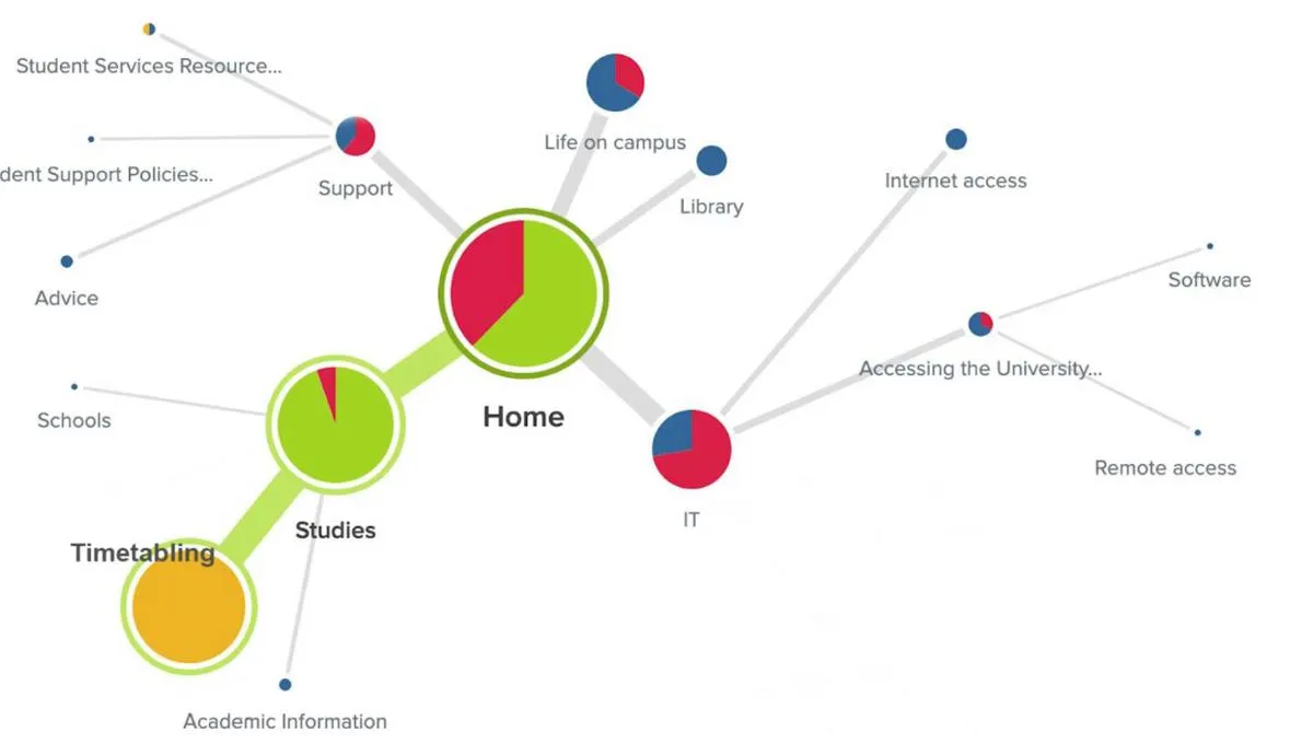
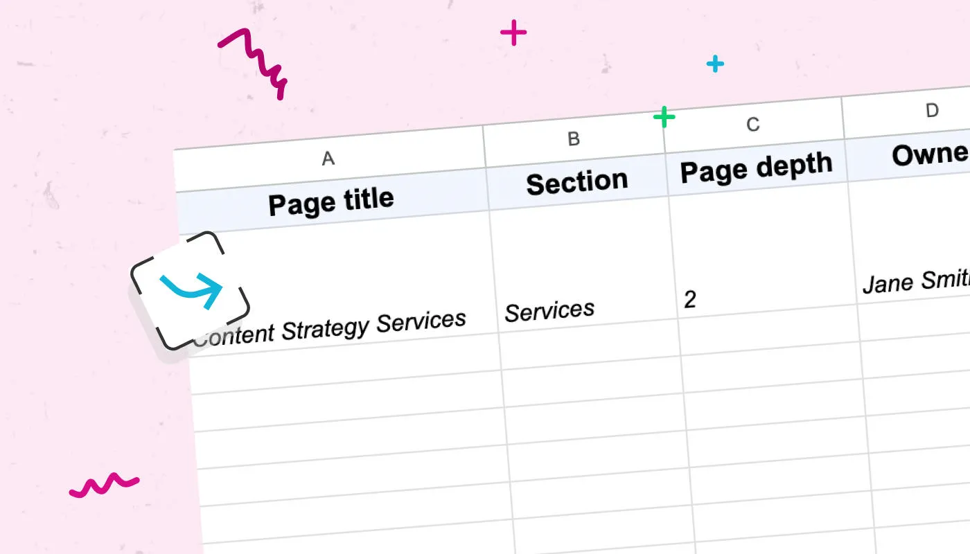
A content inventory or audit allows an information architect to identify areas that are no longer needed, duplications, dead links, consistency between navigation labels and page headers terminology, too much information, and insufficient information. You can use a tool like Insytful to audit your site's content.
Short and simple language
Use short, simple and intuitive language (labels, sections, content types, etc.) that should follow common industry standards so your audience can easily recognise, translate, and scan them.
Reduce the complexity of your architecture.
Create an architectural hierarchy with minimal sublevels and a logical structure. More information doesn't always equal good navigation and sometimes can create further problems that may need to be corrected. Your users should be able to access information with a minimum of clicks or taps.
Make sure your users know where they are
A breadcrumb, for instance, is a common and recognised pattern that helps signpost the user to where they currently are within your website structure. A breadcrumb is a good tool that makes users feel orientated, gives them confidence in navigating quickly, and allows them to go back to previous pages without the help of the browser, especially if they have landed on a page from an outside source, for example.
Use familiar patterns and create consistency.
Keeping logical consistency and familiar patterns within the IA and user interface will increase confidence in navigating the website quickly and positively managing user expectations. For example, a breadcrumb always in the same position, navigation behaviour, section templates, and UI cards will make users easily recognise patterns.
Subscribe to our newsletter
Using user research to validate your information architecture
Card sorting exercise
This method is a reliable and easy technique to identify the first steps of the IA or to test/improve an existing IA.
With the help of a group of participants, we can start to determine categories and subcategories of the Information Architecture. This is done by sorting exercises using a collection (or 'pack') of cards or post-its.
There are two types of card sorting:
- Open card sort lets participants organise sections and categories into groups according to what makes sense to them.
- Closed card sort sees participants (or stakeholders) identify the top-level category, and we ask the participants to organise cards under each section according to what makes sense to them.

Tree testing
Tree testing is a method that allows us to validate a new IA or to test/improve an existing IA against actual user behaviour.
We ask participants to complete specific tasks or to find detailed information using online information architecture tools without any design or visual representation involved. In this way, they focus purely on the steps to complete a goal without any additional distractions.

Scenario testing
Using an interactive prototype or wireframe, we ask participants to complete a specific task or find specific information by navigating the site. This is a form of usability testing.
We observe the journey and how transparent the process is to complete the specific goal. This is a valuable way to test against real content stored in content management systems like Contensis.
In conclusion
Information architecture is one of the fundamental pieces of the user experience process.
I always like to describe IA with the following metaphor:
Imagine you are building a house. IA is the blueprint or the floor plan of your house. It's a way to make sure the rooms in the house make sense. We don't want to end up in a scenario where there is no apparent entrance, windows intersect with walls, no stairs to reach the upper floor, and the bathroom is where the kitchen should be.
Having a blueprint of this imaginary house allows us to structure and create the foundations before building.

"If you wish to make an apple pie from scratch, you must first invent the universe."


