

List field
Log in to add to favouritesPage last updated 13 August 2026
The list field editor allows authors to select from a list of items. You specify these items in the List values text box found in the Editor tab of the Field Settings panel.
The type of list displayed will depend on whether you allow multiple selection. You can choose whether to show single selection lists as a radio button list or as a dropdown. Checkbox lists are always used when multiple selection is set.
Appearance
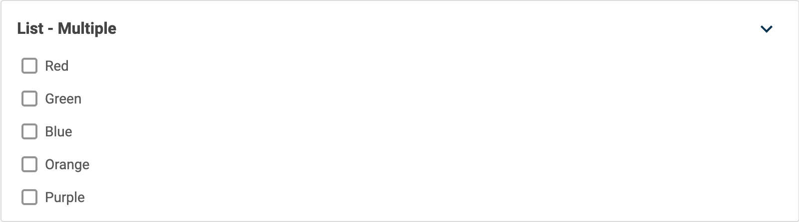
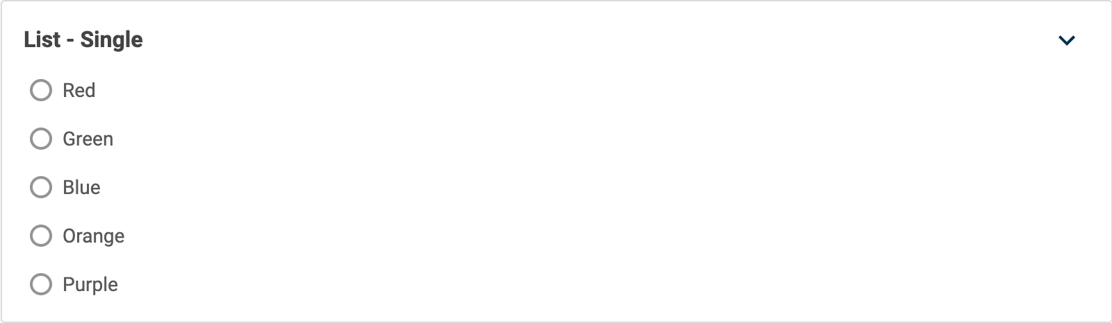

Settings
| Setting name | Summary |
|---|---|
| Name | A text label to identify the field in an entry. |
| Field ID | A sanitised name to be used by the API. |
| Allow multiple items to be selected | Allows you to select multiple items in a list. |
| Read only | Prevents authors from editing the field in the entry editor. |
Supported validation
This field editor supports the following validation methods:
Properties
Common properties
| Property name | Summary |
|---|---|
| Content guidelines | Provides guidance about the content you should add to the field. |
| Field visibility | Determines if the field should be displayed in the collapsed state when opening the entry editor. |
List values
Type a value and select Add to add an item to the list. You can reorder items by dragging and dropping them.