Component field
Log in to add to favouritesA component field editor enables you to insert a component created with the component builder.
Appearance
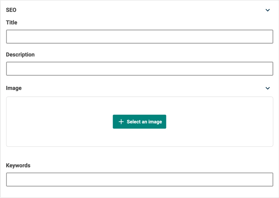
The appearance of a component will vary depending on the fields assigned to it. The example below has been set up to make it easier to capture SEO requirements – in this case with fields for a title, description, image, and keywords.
Settings
| Setting name | Summary |
|---|---|
| Name | A text label to identify the field in an entry. |
| Field ID | A sanitised name to be used by the API. |
| Repeatable | Allows an author to create a collection of content of the same type. |
| Read only | Prevents authors from editing the field in the entry editor. |
Supported validation
This field editor supports the following validation methods:
Properties
Common properties
| Property name | Summary |
|---|---|
| Field editor | The component can be displayed inline to the entry, or be opened in a Component flyout editor which opens the component in a window that is overlaid the primary editor interface. |
| Content guidelines | Provides guidance to an author for the expected content that the field should contain. |
| Field visibility | Determines if the field should be displayed in the collapsed state when opening the entry editor. |