Mobile user experience – tips and best practice
How easy is your website to use on a mobile device? The chances are that over half of your users are visiting your site from a smartphone or tablet.
If your website isn't optimised for mobile you could be losing visitors through frustration and because your site isn’t appearing in search engine results.
Let’s look at some of the ways you can improve your mobile experience.
Reduce interaction cost
Good user experience design is all about reducing interaction cost. That is, taking away any unnecessary steps between a user arriving on your site and carrying out the task they’ve set out to complete.
Removing these unnecessary steps becomes even more important when designing an experience for mobile users. Despite the fact that there’s no evidence our attention spans are actually getting shorter, we often use our mobile devices when we’re doing something else. That might include watching TV, commuting by train, or waiting to pick the up kids from school.
These other activities compete for our attention by presenting any number of distractions. Each of these distractions use up some of our working memory – a bit like the way running lots of applications uses up the RAM in your computer. The problem is that this is the same working memory we use to carry out other tasks, such as navigating websites. This means that trying to fill out an application form on your mobile phone while you stand in a noisy tube train is a lot harder than carrying out the same task sat at a desktop computer in a quiet room.
So, how can you make it easier for people to use your website in the face of these distractions?
Mobile-first design
Mobile-first design involves designing websites to suit the requirements of mobile devices ahead of desktop computers. While mobile users will struggle to use a desktop site, most desktop users will be able to use a mobile site. Mobile-first design is becoming even more important as Google introduces mobile-first indexing – meaning not having a mobile-friendly site could make it hard for people to find your content.
Mobile-first designs will usually be stripped back to include only content and functionality that is absolutely essential to the needs of users. Features will then be added to the desktop site in a technique known as progressive enhancement.
A website following progressive enhancement principles will be usable even if only the HTML loads. This means that users will still be able to access your content and submit forms even if your CSS and JavaScript are broken or unsupported by a specific browser. It also means that your content will be accessible to people using screen readers or other assistive technology.
Here are some other design principles that help to create a pain-free mobile experience:
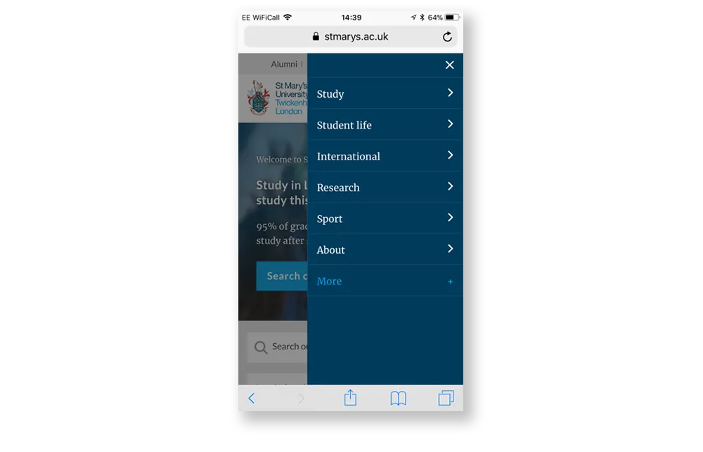
- Keep menus simple and to the point – limit them to 2 sublevels and don’t include too many items.
- Ensure buttons and links are easy to press on a touch screen – make them at least 7 mm (48 pixels) wide and at least 5 mm (32 pixels) away from other buttons.
- Make sure text is easily readable – use a font size of at least 15 pixels and use a colour that creates an acceptable degree of contrast in bright daylight.
- Consider putting important items at the bottom of the screen – as mobile phones grow in size the top of the screen is becoming harder to reach.
- Break content into chunks using white space to make pages easier to navigate.

For instance, designing your homepage around your customers’ top tasks makes it easy for mobile users to access your most frequently used services immediately without having to look through menus or search your site. It also makes your website appear more like the native apps that mobile users interact with every day, and so seems a more familiar mobile experience.
Easy-to-use site search
No matter how great you make your navigation and information architecture, when using large sites that contain a lot of content many users prefer to search for information. You need to make sure that the users who prefer to search rather than use your site navigation can find this information as quickly as possible.

It’s important to make sure that the search box is easy to find and that the search functionality is as intelligent as possible. This helps reduce interaction cost – the amount of work that a user has to do to find the information they are looking for. Here are some ways to do that:
- Make sure the search box is visible. Use a simple magnifying glass icon to call attention to the search box but don’t hide it behind the icon where it’s less prominent.
- Put the search box in the top right corner of the page. Users scan web pages from left to right in an F-pattern. They expect to find the search box in the top right of the page.
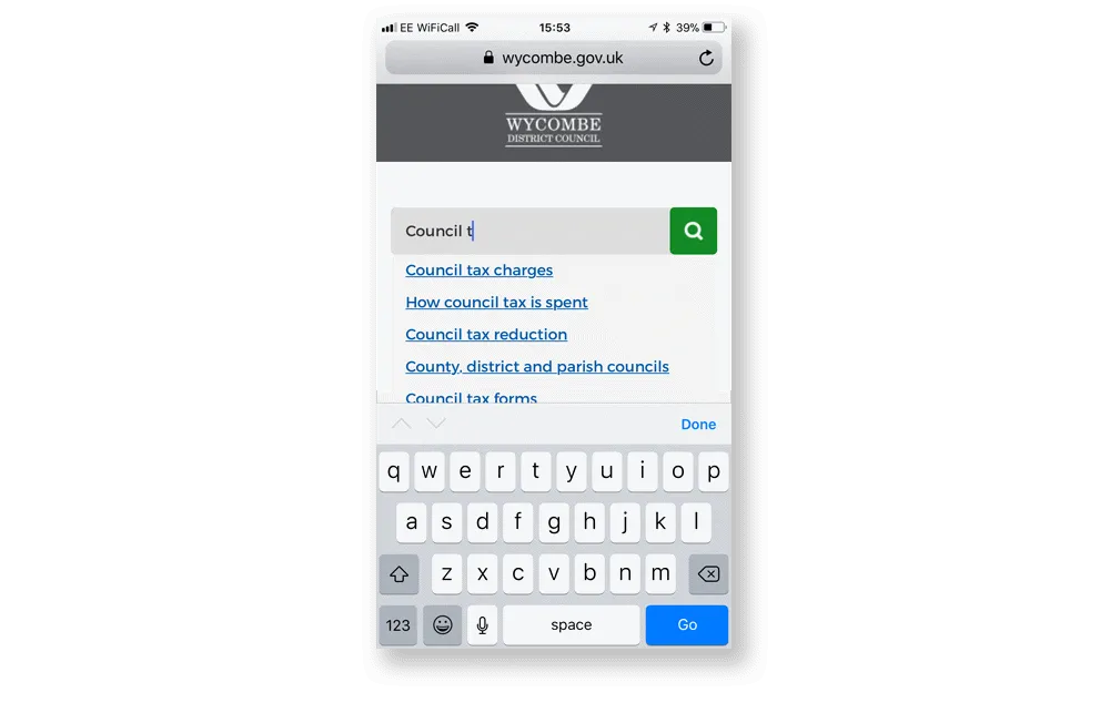
- Use auto-complete or auto-suggest to complete users’ search terms. Typing on mobile devices is difficult and completing users’ search terms saves them from having to type them out in full.
- Provide autocorrect functionality to cut down on typos and speed up the search process. Because the keyboard on mobile devices is so small people make more mistakes. Correcting typos or providing “Did you mean?” style help text reduces failed searches.
- Don’t erase users’ search terms when they submit their query. Users will often refine their search by making changes to their original query. Erasing their last search term makes this harder.
Remember, search is not a replacement for good navigation. If your analytics data shows that a lot of users are searching for the same content, then you should look at where that content sits in your navigation. Employ user research techniques like tree testing to find out how easily users can carry out tasks and identify areas where your navigation can be improved.
Mobile-friendly forms
Forms are one of the most-frequently used elements of any service-orientated website. Using almost any service will involve a users completing a form to provide information. Creating frictionless forms is a vital part of any effort to drive self-service and channel shift – if people get confused or frustrated when completing a form they are likely to abandon it and contact you through other channels.
Thankfully good form design isn’t rocket science. It’s all about making it easy for users to enter information quickly and accurately. Here are some basic principles to follow when designing and building forms:
- Keep forms simple – collecting information you don’t need is a waste of users’ time and is forbidden under Article 5 of the upcoming General Data Protection Regulation.
- Add labels above each field and group similar fields together to reduce cognitive load.
- Use input masking to help users avoid making mistakes.
- Add metadata to help browsers autocomplete common field names.
- Provide real-time validation using techniques such as pattern matching with regular expressions.
Don’t forget to test your forms on real users. It’s not hard, and it could uncover easily-fixed usability issues that would otherwise cost you significant amounts of time and money. You don’t have to test with a wide pool of users – testing with just 5 people will uncover up 85% of usability problems.
Speed
There are few things as frustrating as waiting for a site to load when trying to complete a task online. And, if the task isn’t important, many of us will simply give up. According to a study carried out in 2016, nearly half of us won’t even wait 3 seconds for a site to load. At best this means that more of your users resort to calling you or contacting you through another offline channel. At worst it could cost you a conversion. This could end up costing your organisation millions in lost revenue or extra business costs.
There are also SEO penalties for having a slow site. Google has long recognised the importance of page speed on user experience and have used speed as a ranking factor since 2010. Earlier this year they announced they were extending that to cover mobile searches. This, along with the introduction of mobile-first indexing mentioned above, means that having a slow mobile site could harm your rankings in Google search results.
How to measure performance
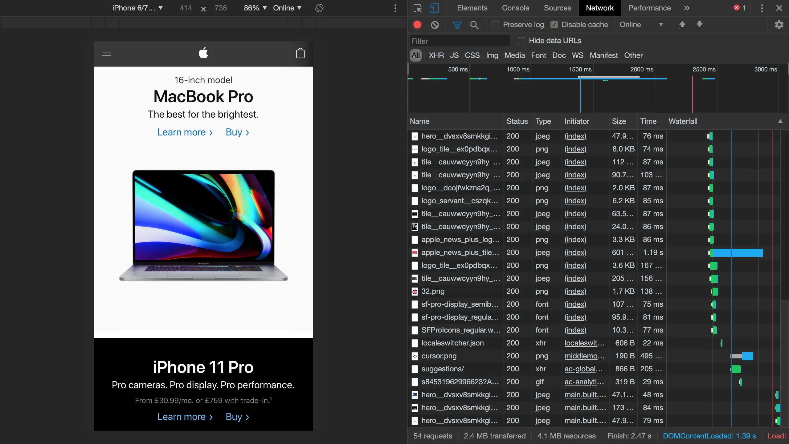
Try using Lighthouse or the Network panel in Chrome DevTools to measure a page’s performance.

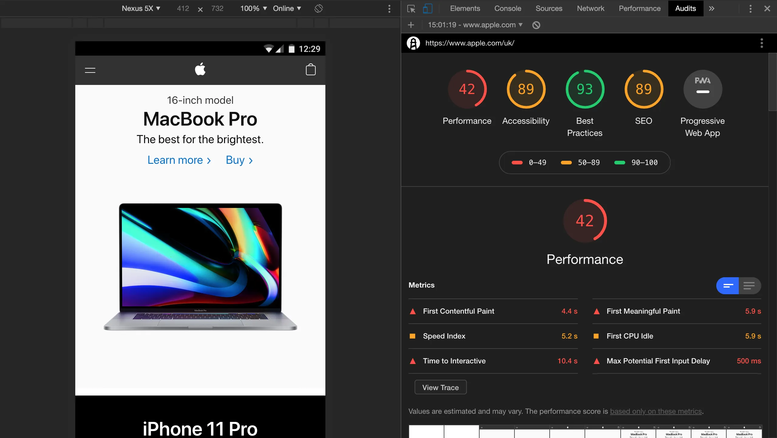
Lighthouse is especially easy to use. It simulates a mid-range mobile device with a 3G connection and runs tests on the page. It provides an easy to interpret report with suggestions on improvements for you to send to your developers.

There are three key indicators of page performance in the Lighthouse report:
First meaningful paint
This is when the primary content of your page is visible. For a blog post this would be the headline and above-the-fold text. It also includes any images, such as product photos, that are essential for users to understand your content.
First interactive
This is first point at which users can interact with the page. At this point most, but not necessarily all, of the UI components on the screen are interactive. The page should respond to user input in a reasonable amount of time, though this doesn’t have to be immediate.
Consistently interactive
At this point the page has completely loaded and is fully interactive.
Remember – not all of your users will be on a high-speed connection. While 4G is available in most major towns and cities, coverage is often patchy in more rural areas. A good target is to get your page to be consistently interactive in under 3 seconds on a 3G connection.
Performance improvements
This 3 second target might seem out of reach if your page currently takes ten times that long to load. However, just a few simple changes can drastically reduce page loading times. Here are some of the steps you can take to make the biggest impact, listed in order of complexity:
- Optimise your images – reduce the file size of images by compressing them without affecting quality. Download your images, compress them using software such as Kraken or ImageOptim, and then reupload them to your site.
- Cut down on unnecessary scripts – all of the analytics, personalization, and other tracking scripts that you add to a page increase the amount of JavaScript that has to be downloaded by a user’s browser. The easiest way to solve this is to get rid of the scripts.
- Lazy-load images below the fold – reduce the time it takes to reach first meaningful paint by only loading images above the fold until a user scrolls down the page.
- Defer JavaScript or load it asynchronously – if you (or your boss) are really attached to your tracking scripts, defer them or load them asynchronously. The same goes for other JavaScript on your page.
- Upgrade your infrastructure – most websites are currently hosted on servers that use HTTP or HTTPS protocol to communicate over the World Wide Web. A new standard – HTTP/2 – offers considerable speed advantages over the older protocols. As well as speeding up the site by allowing more assets to be downloaded concurrently, it also allows the server to push assets it thinks the user will need before they need them, speeding up loading.
Responsive websites vs mobile apps
An increasing number of businesses and organisations are building native mobile apps. It's no wonder, because as much as 90% of time spent on mobile devices is using apps. However, the vast majority of this time is spent using apps that are products in their own right, apps like Facebook, YouTube and SnapChat. And, most consumers still begin their research using search or branded websites – so if you do decide to develop a native app, you still need to have a great website.
Responsive websites also have several benefits over native mobile apps when it comes to user experience:
- A user looking to complete a task on their mobile might not be able to download your app due to data restrictions.
- Website content will appear in search engines results, unlike content in native mobile apps, making it easier to find.
- By following mobile-first design principles you can create a website that works well on desktop and mobile – ensuring a consistent user experience across all devices.
Also bear in mind that responsive websites incur lower maintenance costs than native apps – you only have one platform to maintain as your responsive website should be built to work in any mobile browser. If you decide to offer a mobile app you’ll need to create and maintain apps for various mobile operating systems, at least for the two most widely used platforms, Apple’s iOS and Google’s Android. These apps will require frequent updates as Apple and Google make breaking changes to their operating systems.
Progressive web apps
Progressive web apps, or PWAs, offer the best features of a responsive website and native mobile app in one package. They are normal websites that can be access using a regular web browser, but are built in a way that makes them feel like a mobile app and allows them to be downloaded and used offline. They can also be installed like a native app on Android devices.
PWAs have several advantages compared to both responsive websites and natives apps:
- Users can browse offline – because PWAs cache content and assets they can be used without a data connection
- PWAs preload assets – this cuts loading times by reducing the amount of data downloaded from the server each time a user opens the app
- They allow access to device features – developers can make use of device features and hardware such as notifications, voice recognition, and cameras
- There's no need to push updates through the app store – your PWA will update whenever a user opens it with a data connection
- They're universally available – your PWA won't be subject to any restrictions (such as geographic restrictions) imposed by app stores
If you have identified a user need for a native mobile app and possess the budget to develop and maintain both a first-class website and an app, then go for it. In reality, most organisations work with a limited budget and are better off investing in developing a fantastic website rather than spreading their resources too thinly. PWAs offer a way to have the best of both worlds and provide an improved user experience at the same time.
Conclusion
Ensuring your design is easy to use on mobile isn’t difficult. It’s all about making sure that users can quickly find and download your content – either through your navigation or using your search – and doing everything you can to make it as easy as possible to fill in forms quickly and accurately. The easiest way to check you’ve got this right is to use your site yourself. Even better, get at least five real users to test it. You’ll soon gain some valuable insights into areas you can improve.

