Developing with ARIA to help make your web application accessible
Accessible Rich Internet Applications or ARIA, is a specification created to make interactive content accessible.
Why do we need ARIA?
Websites are becoming more like desktop applications. Unique functionality is being made possible by new technologies, techniques, and devices.
Unfortunately, with the rapid pace of change on the web, visitors who can’t perform all the expected actions on a website – such as using a mouse – are being left behind.
This is why the ARIA specification was drafted – so that creators can continue to build feature-rich web applications with interactive elements and still support those with disabilities.
Who created ARIA?
The ARIA specification was developed by the Web Accessibility Initiative, otherwise known as WAI.
WAI is a W3C scheme sponsored by governments, businesses, and other organisations. Each is committed to making the web accessible by creating useful specifications aimed at helping users with disabilities.
According to the W3C itself:
The World Wide Web Consortium (W3C) is an international community that develops open standards to ensure the long-term growth of the Web.
W3C was formed by the fella who created the web, none other than Sir Tim Berners-Lee! It is a gang of smart forward thinking girls and guys that would like everyone to get along together. With assistance from individuals to whole companies they’ve been able to draft a whole set of guidelines that help everyone.
What is ARIA?
ARIA is a small amount of markup (HTML code) that creators can use to help specify certain rules or logic to screen readers and other assistive technologies.
When I say a small amount, it really isn’t much markup at all.
When writing ARIA markup, you just need to add one of two attributes – the role attribute and the aria-.* attribute (“.*” meaning that what follows “aria-” is a variable).
The role attribute (role="*")
Roles help give screen reader users and other assistive technologies a better sense of where they are on a page.
A screen reader will announce what role they are focused on. This gives the user a better perception of the page layout and what content to expect within each role.
Example
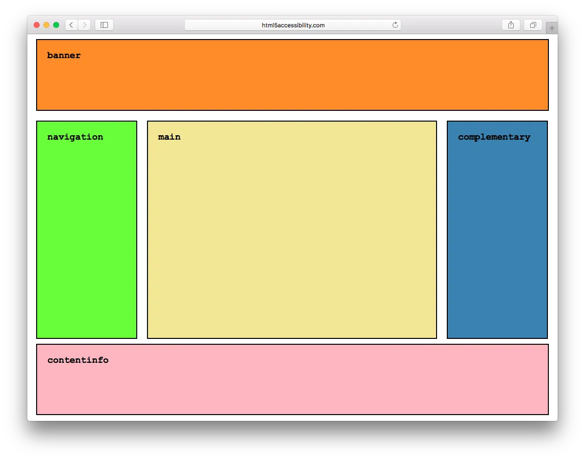
Each container in the screenshot below has been given an ARIA role which appropriately describes the content of that element.

Here is the markup used to render the above page:
As you can see, it’s all very simple to implement. You have a container and you give it a purpose (or ‘role’). A list of these roles and their definitions can be found in the W3C WAI-ARIA specification.
These roles can also be nested. This means a navigation role can be within main, and so on.
States and Properties (aria-.*)
The purpose of states and properties is to let screen readers and other assistive technologies know when an element's state is being altered. So for instance when a checkbox is checked the user is made aware.
With the use of some simple markup tags like aria-checked="true" you can tell assistive technologies when you are changing the state or the property of an element.
Examples:
Check list
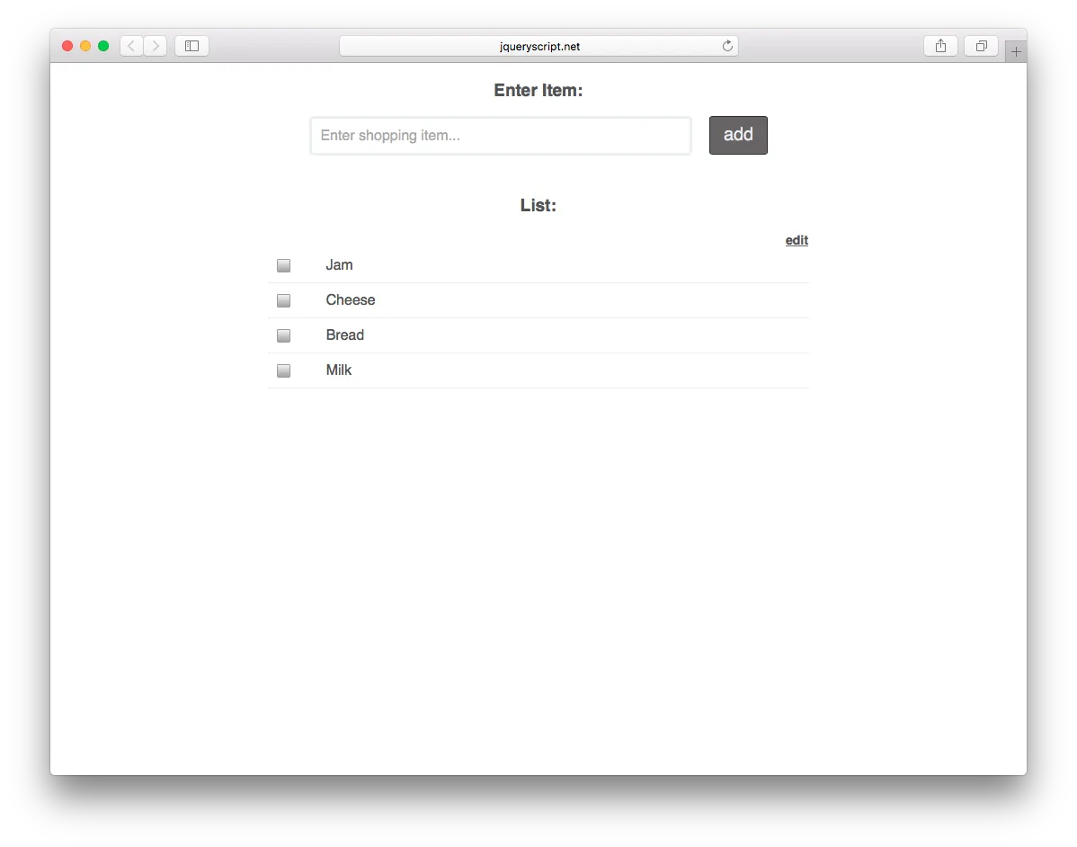
You’ve created a shopping list using HTML and Javascript. Good job.

When someone clicks an item in the list, JavaScript updates the item to have an active state turning the background colour red.
Unfortunately a blind person wouldn’t be able to see that or understand what just happened.
Fortunately that’s easy to resolve with an ARIA state. The answer is to:
Add aria-checked="false" to the list item element.
Get your JavaScript to update to aria-checked="true” at the point that it updates the background colour.
For a full list of available ARIA roles and properties, visit the Mozilla website.
Dialog window
Let’s say you need a dialog window to open up, and this is quite a big change on a page. You are moving the focus position and need to make sure that a screen reader – and therefore the user – is aware.
Here’s the markup you should use:
Here is what the markup is doing;
‹dialog role="dialog"
Tells the browser and assistive technology that this is a dialog box / window.
aria-labelledby="dialog1Title"
Tells the assistive technology where to get the name for the dialog box / window.
aria-describedby="dialog1Desc"
Tells the assistive technology where to get a description of the dialog box / window.
Use your states and properties within a relevant role
It’s important to bear in mind that the majority of states and properties need to be related to a specific role.
So, when using aria-checked="true",the state needs to be related to a relevant role such as role="checkbox".
HTML5 and ARIA roles
Semantic HTML tags are now the norm in the modern HTML5 development process.
A semantic element clearly describes its meaning to both the browser and the developer. Some of the more common semantic HTML tags include ‹header›, ‹nav›, and ‹time›.
Use these as much as possible because they are awesome. Remember though that ARIA states and properties need to be related within an ARIA Role (the majority of the time).
So for example when using ‹main role=”main›, use both the HTML5 tag ‹main and role=”main”.
There are no negative effects from using both, plus when a user is using an older user agent (I’m looking at you, IE 8) it falls back gracefully.
Checking your code
You should always check your markup. This should be done throughout development and then re-checked before publishing. There are two methods that I’d recommend you use to check if you’ve implemented ARIA correctly.
Number 1 - Validate it
When creating any page you should always validate your HTML.
The best HTML validator currently is the Nu HTML checker. Hosted by W3C, it is a free validator that checks all your markup, including ARIA, for any errors.
Wave is an accessibility tool that runs multiple checks on a page. This includes checking whether ARIA tags are available and whether they’ve been implemented correctly.
Number 2 - Give it a go
If you have a Windows PC then I would recommend installing NV Access. It’s free and open source, so it’s always being improved upon.
Macs come pre-installed with VoiceOver. It’s quite the powerhouse, but it's easy just to test a single page.
Both of the above are good, but an even simpler method is to use your mobile device.
iOS has a fantastically simple-to-use and slimmed down version of VoiceOver. It is perfect for ease of use and portability.
Next steps
There is plenty more that ARIA is capable of that I didn’t touch on in this article.
I’ve compiled a list of great articles and websites that have been invaluable to me:
The major stumbling block when trying to implement ARIA into a site, is that others will often think of it as an afterthought during a project. Be sure to keep nagging and pushing for it. It really does help a significant number of the population using screen readers and other assistive technologies.
FAQs
What is ARIA Label?
The aria-label attribute is part of the Accessible Rich Internet Applications (ARIA) suite of attributes used to enhance the accessibility of web content for people with disabilities. Specifically, aria-label is used to provide a concise label for an element when a text label is not visible on the screen.
When certain elements on a webpage do not have visible text labels, such as icons or images, the aria-label attribute can be used to programmatically associate a label with the element. Screen readers and other assistive technologies can then use this label to provide information about the purpose or function of the element to users with visual or cognitive impairments.
Here's a simple example of how aria-label can be used:
<button aria-label="Close" onclick="closeWindow()">X</button>In this example, the button has an "X" as its visible content, but the aria-label attribute provides additional information to assistive technologies, indicating that the button is used to close something.
It's important to note that while aria-label can improve accessibility, it is generally better to provide visible text labels whenever possible. ARIA attributes should be used as a supplement to, not a replacement for, semantic HTML elements and proper labelling practices.
What is an accessible name?
The accessible name is the name or label of an interactive element as perceived by users, particularly those using assistive technologies like screen readers. It is a crucial concept in web accessibility.
The accessible name is determined by a combination of the text content and certain accessibility attributes associated with an element. The calculation of the accessible name depends on the context and the specific attributes used. Some of the key attributes that contribute to the accessible name include:
- Text Content: The text content of the element itself (e.g., the text between <button> tags).
- alt attribute: For images, the alt attribute provides alternative text that serves as the accessible name.
- aria-label attribute: This attribute explicitly defines the accessible name for an element, particularly useful when the visible text is insufficient or absent.
- aria-labelledby attribute: This attribute points to another element's ID whose content should be used as the accessible name.
- aria-describedby attribute: This attribute points to another element's ID whose content provides additional descriptive information that may contribute to the accessible name.
For example, consider a button with an icon:
<button aria-label="Close">
<span>✖</span>
</button>In this case, the aria-label attribute provides the accessible name for the button, ensuring that users of assistive technologies understand the purpose of the button despite the absence of visible text.
It's important for web developers to ensure that the accessible name accurately represents the functionality or purpose of the element to support a positive user experience for individuals with disabilities.


